
Thursday, December 20, 2012
Today's Sphere Progress
Sphere Progress from 12/18/12

Friday, December 14, 2012
3D Sphere progress

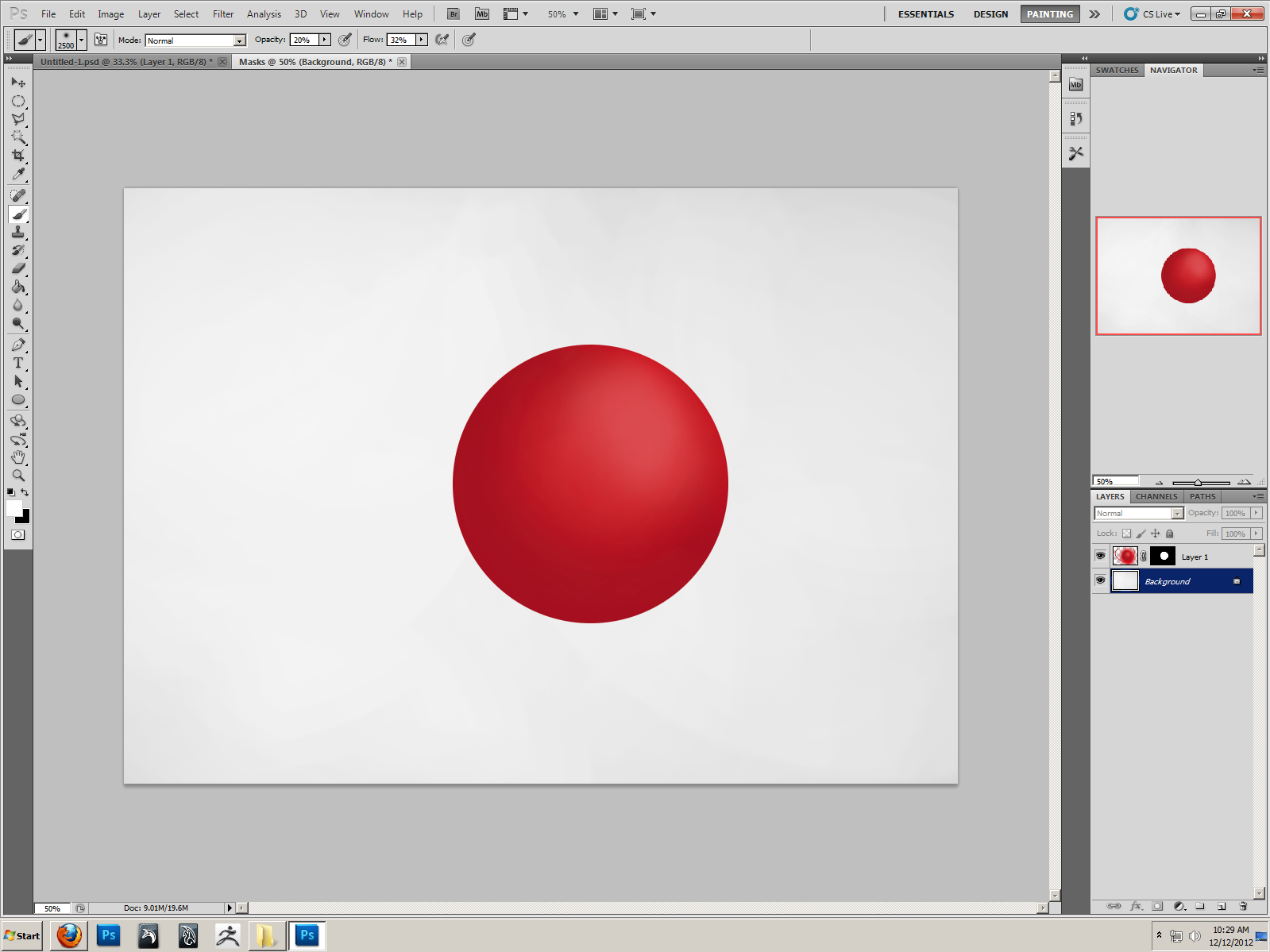
Wednesday, December 12, 2012
Monday, December 10, 2012
Colors

Thursday, December 6, 2012
Playing with Brushes

Tuesday, December 4, 2012
Room So Far
I finished everything I was told to do on the room so far. I added a carpet, window, door, and made a tile ceiling and wooden floor.


Friday, November 30, 2012

Perspective Room


Monday, November 26, 2012
One Point Perspective

Monday, November 19, 2012
Animation Final


Thursday, November 15, 2012
Monday, October 15, 2012
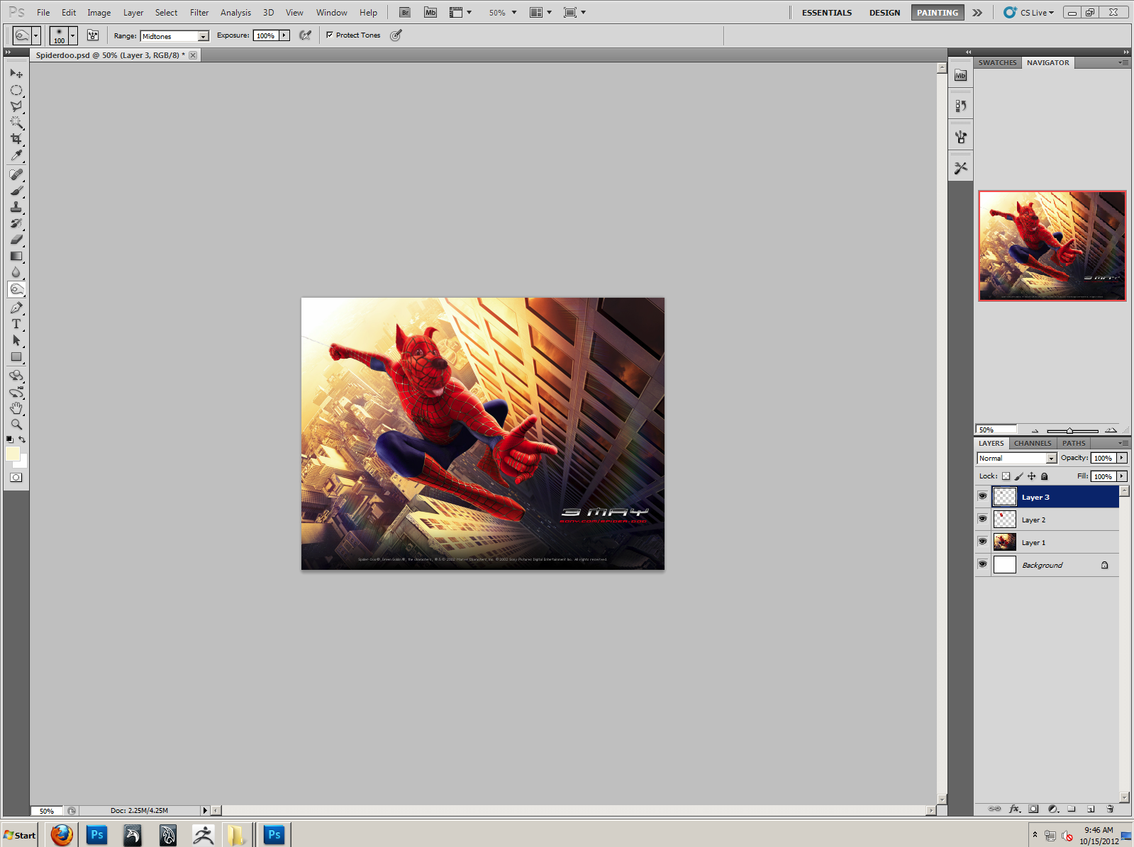
Wednesday, October 3, 2012
"Spider-Doo" Update

Monday, October 1, 2012
Haunted House
I am currently working to turn a Gothic Victorian house into that of one that resembles a haunted house. While the Gothic Victorian era did have many other achievements, it's most recognizable feat was it's architecture and houses I found to be perfect for "spookifying" were easy to find.

This is the one I am most likely to use, it has no true blemish and should be fun to destroy. The lighting is mostly even, though the front steps may give me troubles. This one should be easy to place onto a different landscape.

This one, however eerie, has too many blemishes, while I do like it, my first choice would have to be it's latter. The telephone wires cutting across the shot are a nuisance, along with the foliage nearby. I do, however, like the top of the towers, and might incorporate that into a future version.

While I am not a fan of the choice of colors the owners decided on, I do like the style of this house. The top spire was cut off, however, and a bush is protruding into the photo.The photo itself is also slightly blurry, but the sky behind it only needs minor enhancements to make it more haunting.

This is another of my top choices, the coloring is rather eerie, and there is no tree blocking the view, while there is a lot of foliage, I want to do something that incorporates a overgrown graveyard around the house and they might fit in well. The house itself has some issues, such as not being able to see the doorway.
This is the one I am most likely to use, it has no true blemish and should be fun to destroy. The lighting is mostly even, though the front steps may give me troubles. This one should be easy to place onto a different landscape.

This one, however eerie, has too many blemishes, while I do like it, my first choice would have to be it's latter. The telephone wires cutting across the shot are a nuisance, along with the foliage nearby. I do, however, like the top of the towers, and might incorporate that into a future version.

While I am not a fan of the choice of colors the owners decided on, I do like the style of this house. The top spire was cut off, however, and a bush is protruding into the photo.The photo itself is also slightly blurry, but the sky behind it only needs minor enhancements to make it more haunting.

Thursday, September 27, 2012
Random Piece Inspired by Marilyn Manson

Then, after I was satisfied with the dark rings and cloud like looks of it, I started to play with the filters. Under "Sketch", I found "Chrome" and chose that effect, to be coupled with "Accented Edges" and "Angled Strokes" later on. Finding the product to be rather ragged I went back into the "Filter Gallery" and chose "Chrome" again to even it out.
I have no idea how Marilyn Manson inspired this, but I found it to have a rather Gothic look.
Tuesday, September 25, 2012
"Spider-Doo"


Thursday, September 20, 2012
'Zhino' progress.


Friday, September 14, 2012
Zhino progress

Monday, September 10, 2012
Cutting out the Statue of Liberty

Thursday, September 6, 2012
Final Fix
 | |
| Original |
I started out with what I thought would be easy. Using the clone stamp tool, I erased the wires and poles, replacing the sky and mountain. Feeling that the person behind the dog would be easiest to next take out, I used the clone stamp and healing brush redundantly. After finishing to great proportions with that, I found myself picking at the trash hidden in the bushes and cleaned that up.
I'd have to say that the pole in front of the trees was very tricky to get rid of, but after playing around a bit, I seemingly erased them from view.
 |
| Final dog. |
Final Erase
 |
| Original |
I then turned to the sign coming out of the man's head. This too, was rather easy, but near the buildings I ran into some blending issues. My main brush was the cloning tool, "copying and pasting" things where I needed them to be. The street lights were easy, until it came to the one in front of the cars. The Inko's sign was terribly easy, just like the other parts that happened to be in the sky. I decided to remove the whole sign.
Towards the middle of the mountain I had multiple issues. I tried the healing brush for the first time and thought it to be useless until the repetition was obvious. This became true about halfway into the mountain. I used the healing brush as little as possible, seeing that it often brought in unhelpful, and not close to color, pieces of nearby scenery.
The car was by far the most challenging piece. I started with simple, short, strokes around the wheel, and made my way up the car, not worrying about blending until later. I did however make a mistake that would cost the red sign on the window its life.
All in all, I believe it was mostly a success, but there is always room for practice.
 |
| Final |
Final in Liquefy
 | ||
| My liquefy final |
I then used the push forward tool to give his eyebrows a different arch. After that was finished, I realized that his grin didn't match the more quizzical look I gave him and used the push forward tool again to give him more of a goofy smirk.
I used the push forward tool a lot when it came to his facial features, thinning his nose, chiseling his features, and giving him broader shoulders.
Moving on to his eyes, I thought they were a bit large, so using the shrink tool sparingly to even his eyes and give them a less bug-like look.
Towards the end I started messing with his shirt, moving a button, ruffling the edges, and shifting the collar.
I find them to look similar, but not very close when it comes to the details. It was a rather drastic change, and it was an obvious first try. Hopefully with more experience I will be able to do better.
Subscribe to:
Comments (Atom)